

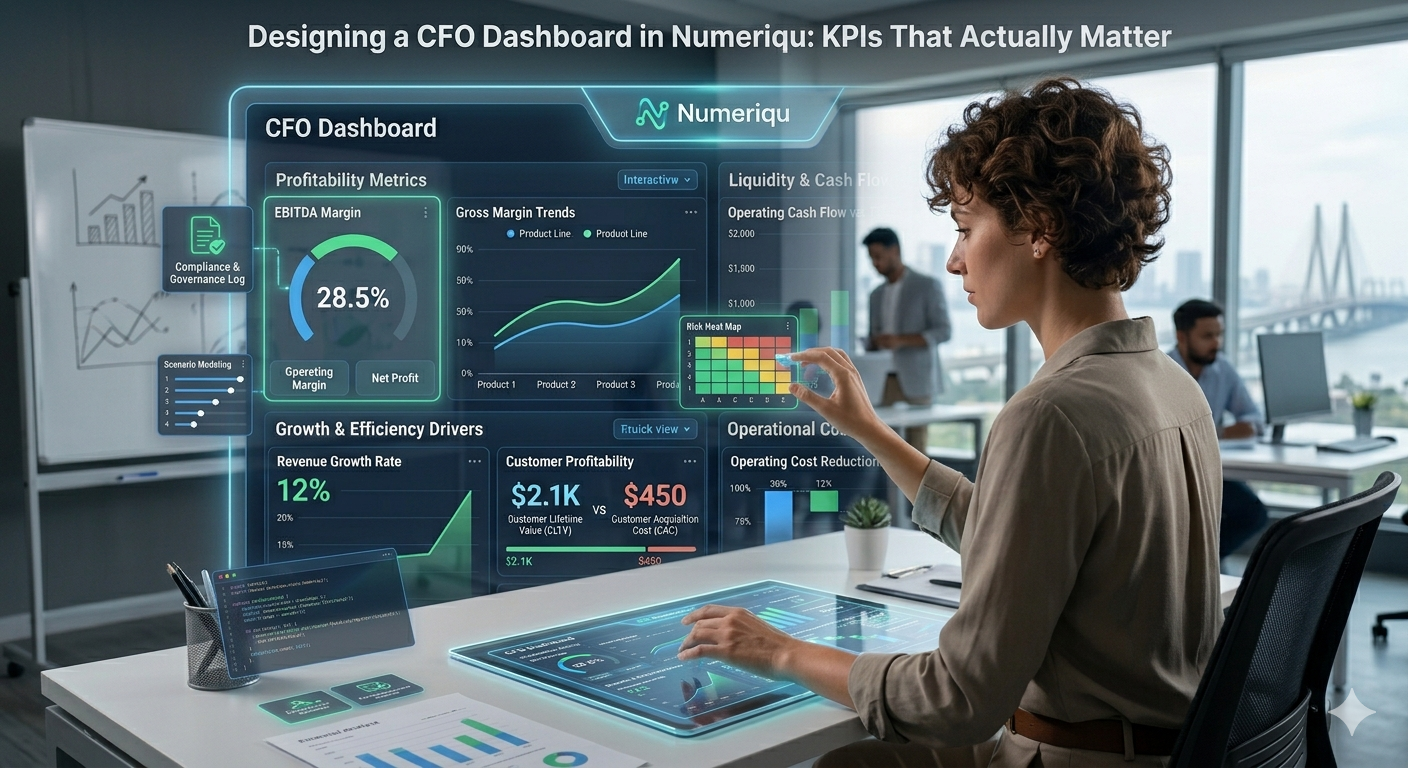

Bringing clarity to fragmented financial data is a persistent challenge for chief financial officers.
Many enterprises grapple with disparate systems, manual reporting, and a lack of real-time insights, hindering their ability to monitor strategic financial health effectively. This fragmentation often leads to delayed decision-making, missed opportunities, and an inability to proactively address financial risks. A well-designed CFO dashboard serves as a crucial business intelligence platform, consolidating vital information to empower leadership with actionable data. It provides a centralised view of performance, enabling executives to track strategic KPIs and make faster, more informed financial decisions that drive organisational growth and stability.
The Evolution of Financial Monitoring
Historically, executive financial reporting relied heavily on static spreadsheets and quarterly presentations, often outdated by the time they reached the boardroom. Today’s dynamic economic landscape demands more agile and responsive insights. Modern business intelligence platforms have transformed this, offering interactive dashboards that consolidate financial data from various sources. These dashboards are designed to move beyond mere operational reporting, focusing instead on strategic indicators that illuminate the true health and trajectory of an organisation.
Identifying Key Performance Indicators (KPIs) That Truly Matter
For a CFO dashboard to be truly effective, it must prioritise KPIs that directly correlate to strategic objectives. Generic metrics often obscure the critical insights needed for executive-level decisions. The focus should be on profitability, cash flow, liquidity, efficiency, and growth drivers.
- Profitability Metrics:
- Gross Profit Margin: Revenue less cost of goods sold, divided by revenue. Indicates operational efficiency.
- Operating Profit Margin: Gross profit less operating expenses, divided by revenue. Shows core business profitability before interest and taxes.
- Net Profit Margin: The ultimate measure of a company’s profit, after all expenses, interest, and taxes.
- Cash Flow & Liquidity:
- Operating Cash Flow: Cash generated from regular business operations. Essential for sustainability.
- Free Cash Flow: Operating cash flow minus capital expenditures. Cash available for debt reduction, dividends, or acquisitions.
- Days Sales Outstanding (DSO): Average number of days to collect receivables. Impacts working capital.
- Current Ratio: Current assets divided by current liabilities. A measure of short-term liquidity.
- Efficiency & Operational KPIs:
- Working Capital Turnover: Revenue divided by working capital. How efficiently working capital is used to generate sales.
- Inventory Turnover: Cost of goods sold divided by average inventory. Indicates inventory management efficiency.
- Growth Drivers & Strategic KPIs:
- Customer Acquisition Cost (CAC): Total sales and marketing cost divided by new customers acquired.
- Customer Lifetime Value (CLTV): Predicted net profit attributed to the entire future relationship with a customer.
- Revenue Growth Rate: Percentage increase in revenue over a period.
- EBITDA Growth: Growth in Earnings Before Interest, Taxes, Depreciation, and Amortisation, a proxy for operational profitability growth.
Selecting the right dashboard KPIs requires alignment with the overall corporate strategy and an understanding of the specific industry context.
How NumeriQu Enables This Capability
NumeriQu provides a robust platform for enterprise financial intelligence, significantly enhancing the capability to track and analyse critical financial KPIs. Unlike traditional business intelligence tools that often require extensive data preparation and custom scripting, or standard ERP reporting modules that are limited to transactional views, NumeriQu is purpose-built for finance and accounting workflows.
Enterprises leverage NumeriQu for deep integration into their real-time financial data streams, enabling sophisticated variance analysis against budgets, forecasts, and prior periods. Its financial reporting automation capabilities streamline the generation of complex reports, reducing manual effort and potential errors. Numeriqu excels in reconciliation across multiple entities and accounts, ensuring data accuracy and completeness. For multi-entity organisations, its consolidation engine automatically aggregates financial data, handling intercompany eliminations and currency conversions with precision. This deep functional integration ensures audit readiness, providing clear data lineage and robust controls. Furthermore, NumeriQu’s advanced analytics extend to scenario modeling, allowing CFOs to simulate various financial outcomes based on different assumptions, supporting proactive strategic planning rather than reactive reporting.
Designing an Executive-Centric Dashboard Layout
An effective CFO dashboard layout must be intuitive, visually clear, and prioritise the most critical information at a glance. It’s not just about what data is presented, but how. Key considerations include:
- Visual Hierarchy: The most important KPIs should be prominently displayed, perhaps in a large, easy-to-read format at the top.
- Interactivity: Users should be able to drill down into specific metrics for more detail, filter by time period, region, or business unit, and compare performance against benchmarks.
- Contextualisation: Each KPI should ideally be accompanied by its target, trend line, and a brief explanation of what it signifies.
- Alerts and Anomalies: Visual cues (e.g., color-coding for red/yellow/green) should highlight KPIs that are off-track or show unusual patterns, prompting immediate investigation.
A typical dashboard might feature an executive summary view on the main screen, with drill-down options to specific financial statements, departmental performance, or project profitability metrics.
Traditional vs. Modern Dashboard Approaches
The distinction between traditional and modern dashboard approaches is significant for enterprise financial management.
| Capability | Traditional Approach (e.g., Spreadsheets, Basic ERP Reporting) | Modern AI System (e.g., Integrated Financial Platform) |
| Data Aggregation | Manual, prone to errors, time-consuming. Data often siloed. | Automated, real-time, consolidated from diverse sources (ERP, CRM, external data). |
| Data Lineage Tracking | Difficult to trace data back to source, audit trails often weak. | Clear, auditable data trails from report to original transaction. |
| Multi-Entity Consolidation | Manual consolidation, complex intercompany eliminations, prone to discrepancies. | Automated, rule-based consolidation with built-in intercompany matching and currency translation. |
| Audit Readiness | Requires significant manual effort for documentation and validation. | Embedded controls, versioning, and automated documentation support compliance. |
| Scenario Modelling | Limited to static “what-if” analyses in spreadsheets, difficult to scale. | Dynamic, multi-variable simulations, predictive analytics, risk assessment. |
The modern approach, powered by platforms designed for finance, vastly reduces the operational burden while significantly enhancing the depth and accuracy of financial insights. This shift allows finance teams to move from data compilation to strategic analysis, a critical differentiator in today’s competitive landscape.
Target Users and Differentiation
While CFO dashboards are primarily for the Chief Financial Officer, their insights resonate across the executive leadership team. CEOs gain an overarching view of financial health, enabling strategic resource allocation. Operational heads can see the financial impact of their departmental activities, fostering accountability. The key differentiation of a well-architected CFO dashboard lies in its ability to present a cohesive narrative of financial performance that is directly linked to business outcomes, rather than just a collection of numbers.
Technology Maturity and Enterprise Adoption Timeline
The maturity of financial intelligence platforms has reached a point where enterprise adoption is not just beneficial, but imperative. Early adopters, often larger corporations with complex structures, have already integrated advanced dashboard solutions. For organisations still relying on legacy systems, a phased adoption timeline typically involves:
- Phase 1: Data Integration & Foundation (6-12 months): Connecting core financial systems (ERP, GL, budgeting tools) to the platform and ensuring data quality.
- Phase 2: Core KPI Dashboard Deployment (3-6 months): Developing and rolling out initial executive dashboards focusing on critical profitability and cash flow KPIs.
- Phase 3: Advanced Analytics & Expansion (6-12 months): Incorporating predictive analytics, scenario modelling, and expanding dashboard access to broader leadership.
- Phase 4: Continuous Improvement & Optimisation (Ongoing): Refining KPIs, integrating new data sources, and leveraging AI for deeper insights into financial trends.
Factors influencing this timeline include data cleanliness, existing IT infrastructure, and the organisation’s capacity for change management. Companies embracing a data-driven finance culture will naturally accelerate adoption.
Scenario 1: Optimising Working Capital
Problem: A manufacturing enterprise was experiencing inconsistent cash flow and high operational costs due to inefficient working capital management. Accounts receivable cycles were long, and inventory levels were often misaligned with demand, leading to carrying costs and obsolescence.
Implementation: A CFO dashboard was implemented to centralise KPIs like Days Sales Outstanding (DSO), Inventory Turnover Ratio, and Cash Conversion Cycle. The dashboard provided real-time visibility, identifying bottlenecks in the billing and collection process and highlighting slow-moving inventory categories. Alerts were configured to notify management when DSO exceeded a 60-day threshold or inventory turnover dropped below target.
Measurable Outcome: Within two quarters, the average DSO was reduced by 15 days, freeing up significant operating cash. Inventory turnover improved by 18%, resulting in a 10% reduction in warehousing costs and a measurable decrease in obsolete stock write-offs. The improved working capital efficiency supported increased investment in new production technologies without external financing.
Scenario 2: Strategic Investment Evaluation
Problem: A technology company struggled to assess the financial viability of multiple simultaneous R&D projects and potential acquisitions. Manual financial models were time-consuming to update and lacked integration with actual performance data, leading to delayed investment decisions and suboptimal resource allocation.
Implementation: The CFO dashboard was extended to include project-specific KPIs such as Return on Investment (ROI), Payback Period, and Net Present Value (NPV), dynamically linked to budget vs. actual spend and projected revenue streams. The dashboard also incorporated scenario modeling capabilities, allowing the finance team to instantly evaluate the financial impact of different investment thresholds or market conditions on each project and acquisition target.
Measurable Outcome: The time taken for initial investment evaluation was reduced by 40%, accelerating the decision-making process. By providing clear, data-driven insights into potential returns and risks, the executive team was able to confidently greenlight two high-growth R&D initiatives and successfully divest from an underperforming subsidiary, leading to a 7% increase in overall portfolio profitability over the fiscal year.
Before vs. After: The Impact of a KPI Business Dashboard
The transformation from traditional reporting to a robust KPI business dashboard is profound:
- Reporting Speed:
- Before: Weeks for monthly reports, days for weekly updates.
- After: Real-time access to key metrics, instant drill-downs.
- Error Reduction:
- Before: High potential for manual errors in data aggregation and calculation.
- After: Automated data flows and validated calculations, significantly reducing inaccuracies.
- Decision Making:
- Before: Reactive decisions based on historical, often outdated, data.
- After: Proactive, data-driven decisions supported by current performance and predictive insights.
Key Takeaways for Designing a CFO Dashboard
- Prioritise strategic KPIs directly linked to business objectives, not just operational metrics.
- Ensure the dashboard design is intuitive, interactive, and provides immediate visibility into performance trends.
- Leverage modern financial intelligence platforms for automated data aggregation, reconciliation, and advanced analytics.
- Focus on clarity and context for each KPI, including targets, trends, and explanations.
- Understand the critical difference between generic BI tools and finance-specific solutions designed for complex workflows.
Frequently Asked Questions About CFO Dashboards and KPIs
What is the primary benefit of using a CFO dashboard?
The primary benefit is enabling faster, more data-driven financial decisions. By centralising and visualising strategic KPIs, executives gain real-time insights into profitability, cash flow, and growth drivers, allowing for proactive adjustments and strategic planning. A comprehensive dashboard provides a cohesive view of the organisation’s financial health.
How do I choose the right KPIs for my executive dashboard?
Choosing relevant KPIs involves aligning them with your organisation’s strategic goals and industry benchmarks. Focus on metrics that measure performance across profitability, liquidity, efficiency, and growth. Engage executive stakeholders to identify the most critical indicators that truly drive value and reflect strategic outcomes rather than just operational activities.
Can a KPI business dashboard help with forecasting?
Yes, an advanced KPI business dashboard often integrates with forecasting models. By tracking current performance against historical trends and budget, it can provide a foundation for more accurate financial projections. Many modern platforms also offer scenario modeling capabilities, allowing CFOs to test different assumptions and understand their potential impact on future financial results.
What differentiates a CFO dashboard from standard ERP reporting?
A CFO dashboard is designed for strategic executive oversight, focusing on high-level, actionable KPIs and trends across the entire organisation. Standard ERP reporting, while comprehensive, often provides transactional details and operational reports. A dashboard offers a consolidated, visual summary with drill-down capabilities, whereas ERP reports require more interpretation and manual aggregation for executive consumption.
How often should a CFO dashboard be updated?
For strategic decision-making, a CFO dashboard should ideally update in near real-time, or at least daily, for critical KPIs. This frequency ensures that executives are always working with the most current financial picture, enabling them to react quickly to significant shifts or emerging trends. Less critical metrics might be updated weekly or monthly, depending on their impact and volatility.
Designing an effective executive dashboard is no longer a luxury but a strategic imperative for CFOs navigating complex financial landscapes. By focusing on KPIs that truly matter, leveraging purpose-built financial intelligence platforms, and adopting an executive-centric design, organisations can unlock the full potential of their financial data.
If your organisation is evaluating scalable operating models, Designing a CFO Dashboard in NumeriQu: KPIs That Actually Matter may warrant a structured review across cost, governance, and long-term operational resilience.
To explore what that could look like in practice, contact NumeriQu for a consultative discussion.